Culture & the Family
The unflattenable curve
April 24, 2020
Trent England & Curtis Shelton
Some of the media, and some politicians, are lying to us with data that are true.
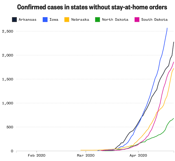
NBC News posted a dishonest story (‘In some rural states with no lockdown orders, cases on the rise’) about the five states that never imposed shutdowns. It included this graph:
We all know the importance of “flattening the curve.” Hospitals in parts of China and Italy ran out of beds and equipment. Some people died who might otherwise have survived, and medical staff were put at greater risk. The same thing almost happened in New York City—but the curve there did flatten out and is now going down.
Well, at least some graphs show it is going down. It depends on how the data are represented. When doctors and scientists talk about “the curve,” they mean the number of new cases or active hospitalizations each day. But NBC’s graph, above, shows cumulative cases. This means adding today’s new cases to every earlier day’s cases. In a graph like that, the curve can never go down and can only flatten out if the disease is completely eradicated.
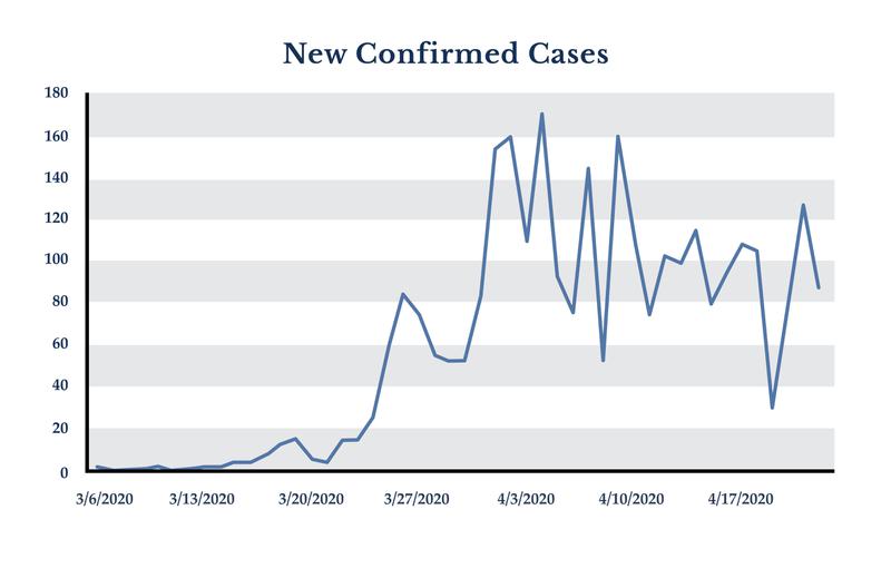
A graph that shows “the curve” looks like the one below, which shows the number of new cases each day in Oklahoma:
This is what the Oklahoma chart would look like using NBC’s method of cumulative cases:
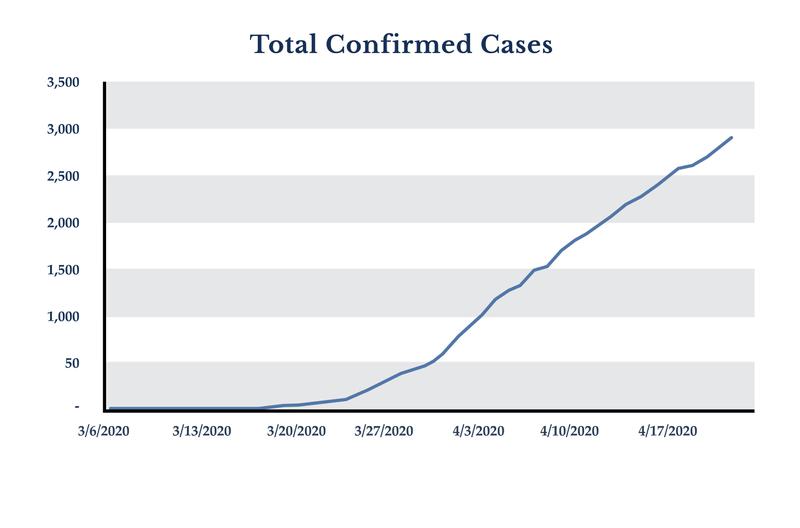
Let us be blunt: no one who is talking about flattening the curve should then highlight a graph of cumulative cases. We have talked with people who believe that the pandemic is accelerating rather than plateauing or even beginning to decline—as it is in Oklahoma and most of the United States and the world—because of media or politicians pushing these charts.
The new cases graph may be sporadic, but comparing the trend lines from March and April shows that Oklahoma has, in fact, flattened “the curve.”
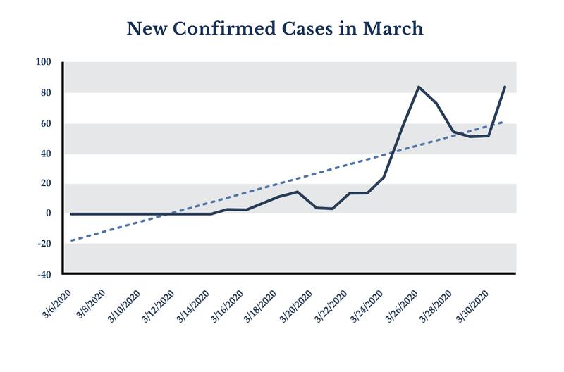
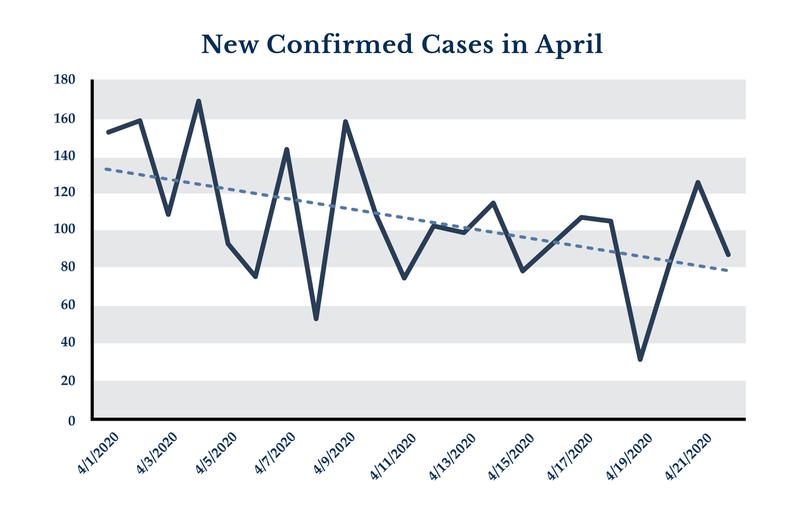
As the virus began to grow throughout March new cases per day steadily climbed. But so far in April, the number of new cases has been trending downward as the second graph shows.
That brings us back to the egregious NBC graph. NBC shows cumulative cases in each of the five states without shutdowns. First, it provides no other state or national data for comparisons. This makes the chart almost meaningless from the get-go. But the axes are also very clever. By stretching back the x-axis, the chart is made to look like there is a sudden explosion happening right now. This is the easiest way to manipulate people with graphs like this, simply by adjusting where the curve appears and how steep it looks.
For more informative graphs, including comparisons between all states (revealing that the five states without lockdowns are doing just fine), see the New York Times’ coronavirus data page.